
Design 4 of 31DC2013 - Green Nails
It's not easy being green...unless you're green nail polish that is. Because that's one of the things I find the best about polish - all colors are fun. Even if they don't look particularly complimentary with your skin tone, one can still be rebellious and wear them anyway. If really worried, those colors can be worn just around the house, like fat-pants and fluffy slippers. LOL.
Nail polish can be removed, no harm, no foul. And the bad colors are tucked away in the Melmer with all the other colors, so no one sees them if you don't want them to. Unless.....you're a crazy proud polish collector who's joined the bold people posting their adventures in nail painting like me recently, of course. Then...well, you show your love for every color and hope like heck that everyone only focuses on the awesome nails and ignores the skin tone around them. [Please.]
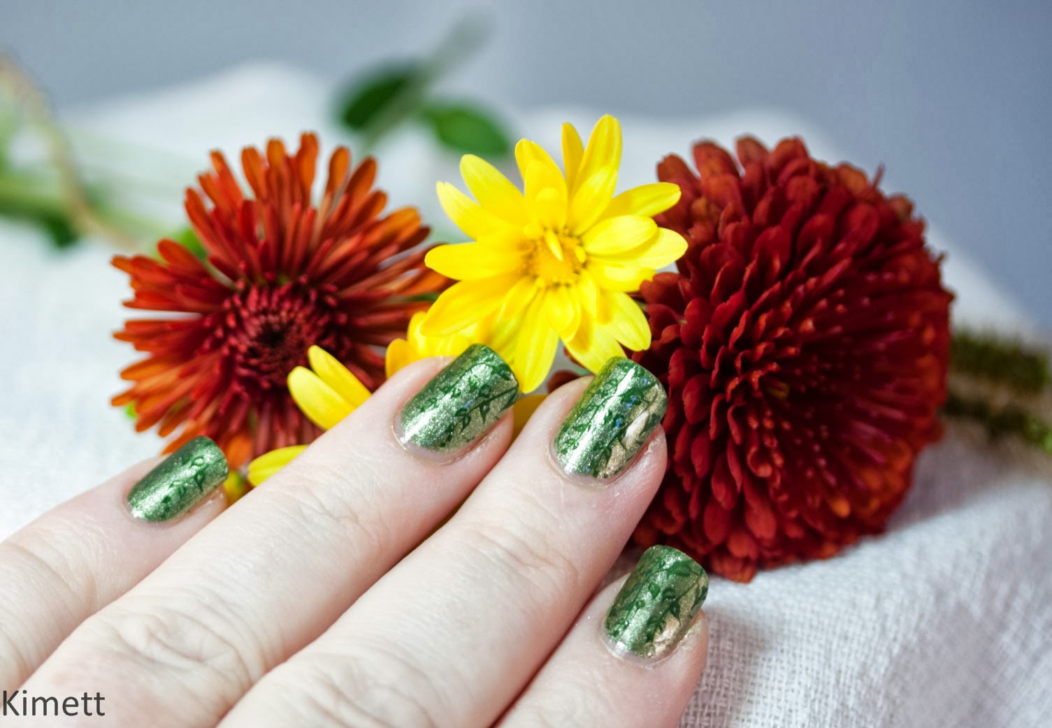
Aren't those flowers gorgeous? OK, so the nails are sorta secondary in this photo, but that's because they weren't the whole story that day. See...my Mom was visiting, and so, we did the whole "pick out the polish, try out design ideas, paint & stamp the nails, and play photography studio" together one morning. By the way, you will know when you have a devoted fan. Not only does that person do all of that with a smile while ignoring your annoying perfectionism (i.e., crankiness); but, she also gets excited about a nail polish color that she doesn't particularly like.
Or, maybe she's really just the unfortunate house-guest who is stuck being the unwitting accomplice to the color-crazed polish psycho and too afraid to say "no, I'm not interested in watching the paint dry". You can decide. But it's my story, so I'm going with the first version.

Back to the nails. This was a pretty metallic muted green base with a hunter green cream polish stamped with a delicate leafy print. I'm not sure what the plant is exactly - I've seen it used in terrestrial designs like mine but also as an aquatic plant too. Either way, it's pretty.


I chose to position the stamp so that the bottom was the tip of my nail having the plants grow up to my cuticle. In hindsight, I wish I had done it the other way around. How do I know this? Because I unintentionally placed it this way twice on my right hand and decided it looked better that way.
Happy accident. Anyway... Mom went out and picked the flower props from our yard (yes, she got to escape for a bit while I top-coated these beauties), which were both appropriate for the design and fun! These pictures don't quite do the nails justice as my photography skills aren't up to the challenge of metallics yet, but we did nail-it on the green design challenge, if I do say so myself. Thanks, Mom. :)
Swatches below:

Materials Used:
Rimmel: Rags to Riches (base)Zoya: Hunter (stamp)
Mash: plate 50
Inspirations:
Mom's creative visions of Green"31 Design Challenge" (see my intro post here)
 |
| courtesy of Chalkboard Nails |
Till next time,
Kimett