Design 1 of 31DC2013 - Red Nails
Even though these nails don't represent a complicated or time consuming design, they were still a success. It's not always easy to find the right combination of polishes to layer so that they look good and don't detract from the beauty of the individual polishes as well. But, if I don't say so myself, these two colors together were capable of transporting someone to another place...oh, maybe say from Kansas to Oz. LOL
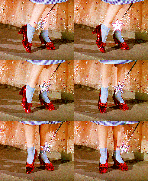
The top layer sparkle made me think of Dorothy's ruby red slippers. Although I don't remember clicking my heels, I did stare at my fingertips for longer than is socially acceptable.
In the bright light, the pink was stronger but in lower light, the red glowed from below. I should have put a second top coat on so that they didn't have a bumpy appearance, yet in real life they looked pretty smooth. And even though the top layer was full of glitter, they were a prize to remove (pun intended - see polish name below).
And a shot of the swatches of the two colors I used. The red cream is absolutely a dream and I am fond of a brighter tone than a classic red. I was very sad when Borghese stopped making nail polishes as I have been happy with the few I did get and loved their double brush.
Materials Used:
Borghese: Che Bella Red (red cream)
Nubar: Prize (magenta base with scattered holographic glitter)Inspiration Sources:
 |
| courtesy of Chalkboard Nails |
Till next time, Kimett


